Want to know if the things you do come off as corporate to others? Then ask yourself this: Do my policies, products, presentations, performances, or practices make the people who experience them smile or sigh? (The alliteration was on purpose, oh yes!)
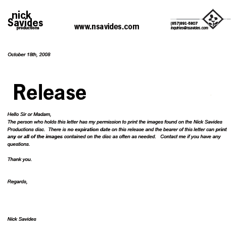
Below, I’ve included a release that I designed for when I deliver photographs on a CD. (As you may know, most reputable photo developers will ask for a release before printing high-resolution images from a disc.) What’s the point of including a boring document in this magnificent blog? Well, good reader, continue onward, and soon you shall know.
I didn’t include the (resized) form to suggest that I’m the best designer ever. I’m sure there are hundreds if not thousands of designers out there who can come up with a more compelling layout. But there is something pleasing to me about this particular form. It makes me smile. From a distance, it declares its function, and it defies convention with a sense of distinction. Maybe you don’t like it though. That’s OK. Design your own forms that look better, and you’ll make us both happy.
Normally, forms make me sigh. They are slapped together without much thought and they reek of corporate, bureaucratic language. I associate them with words like boredom, obligation, and inhumanity. I like my customers too much to wish those things on them, so I took the time to design a more interesting form for them, a form that I hope will help them smile just as it does for me. This took me an extra hour or two, but I think my customers are worth it. Are your customers and acquaintances worth the extra effort?
It amazes me that companies spend millions of dollars to get their advertising just right, but then they stuff their elegant products with inarticulate, soporific manuals and anti-human legal documents. Boring manuals are the norm, but what if a company started writing manuals of elegance, clarity, and wit? Would this not be a competitive advantage in the marketplace? I don’t know about you, but I personally would rather buy from a company who astounds me with excellent manuals than from a company who throws singing squirrels at me, trying to persuade me to buy their (squirrelly?) stuff.
And why should reading a legal document be to your spirit what the dentist’s drill is to your tooth? Take a look at the GNU General Public license here for example. Not bad. The language is easy enough to understand, but there’s room for improvement even here: I know that you lawyers write stuff in ALL CAPS because you want to make it harder to read, but how would you like it if I WROTE THE REST OF MY POSTS LIKE THIS or if I walked around yelling at everyone? Not cool? Exactly. The law is there to keep society running smoothly. It’s a good thing, so why not write it in a way that helps us admire both the law and your humanity?
In one of their promotional PDFs the AIGA (The American Institute of Graphic Arts) writes, “The role of the designer is to have ideas – and to inspire them in others.” Great quote. Everyone has ideas, and everyone who isn’t entirely evil enjoys inspiring other people at least in some way. Not convinced? Lets assume that you get paid the same for doing your job whether you do it in a banal, uninspiring way that makes people sigh or in a way that inspires them and makes them smile. Which one would you choose? You don’t have to be talented at illustration to be a good designer; all you have to do is have ideas and aim to make people smile with them. The rest is just attention to details.

0 Responses to “The Smile or the Sigh: Why Delighting Us Matters”